
Operating System
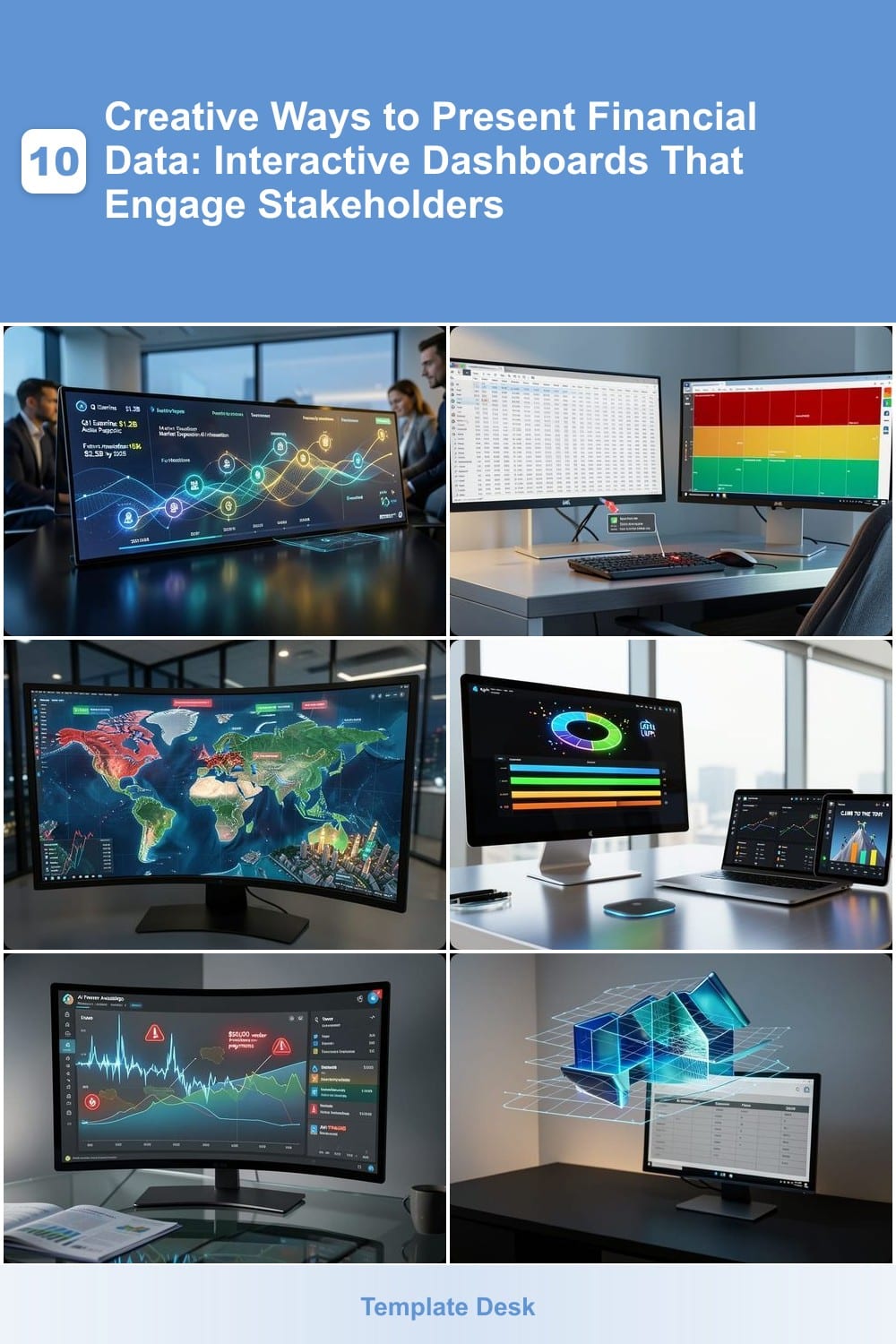
Boring spreadsheets won’t cut it in today’s data-driven world. These 10 interactive dashboard techniques transform complex financial data into engaging visual stories that captivate stakeholders and drive better decisions—without requiring advanced coding skills.
Animated Storytelling Timelines for Revenue Growth
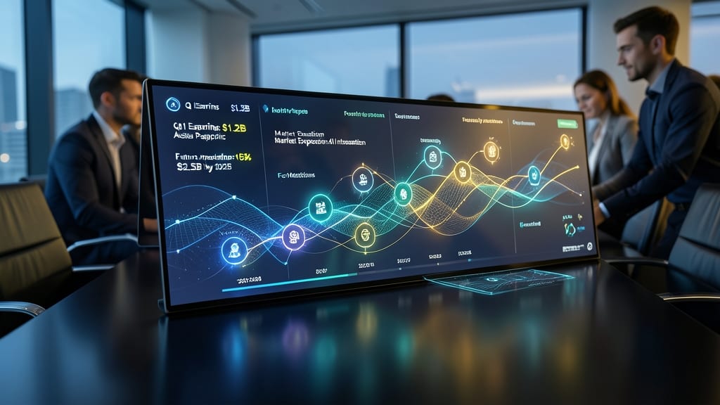
Board meetings don’t have to feel like a math lecture—animated storytelling timelines turn dry revenue data into a gripping narrative. Instead of static charts, you can visualize growth as a dynamic journey, complete with interactive milestones, trend highlights, and future projections that unfold like a movie.
Tools like Power BI’s built-in animations or Canva’s motion graphics let you create smooth transitions between quarters, color-code key achievements, and even overlay text callouts for context. The result? A cinematic presentation that keeps executives engaged while making complex trends instantly understandable—no PhD in finance required.
This approach shines for quarterly reviews, investor pitches, or strategic planning sessions where storytelling matters as much as the numbers. Just add a compelling narrative, and watch your audience lean in. ✨
Interactive Heatmap Budget Allocation Tools
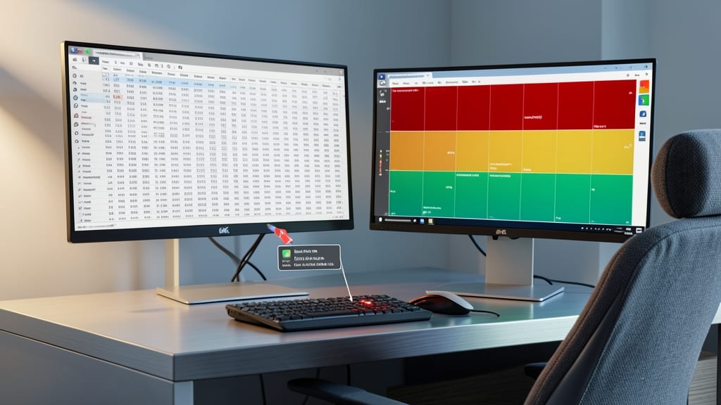
Tired of digging through endless spreadsheets to spot budget anomalies? Interactive heatmap tools transform raw financial data into intuitive color-coded grids, where high-spending categories glow red and efficient allocations stay green.
Platforms like Power BI’s heatmap visuals or Tableau’s treemap tools let you hover over cells to reveal exact figures, drill down into subcategories, and compare quarters side-by-side. The gradient intensity automatically adjusts to highlight outliers—like that unexpected spike in Q3 marketing costs—while real-time updates sync with live data sources. For teams using Excel, add-ins like Power Query can generate similar visuals with minimal setup.
This approach is a game-changer for finance managers reviewing monthly budgets or startup founders tracking burn rates. No coding required—just plug in your data and let the colors do the talking. 💡
Real-Time Stock Performance Geospatial Maps
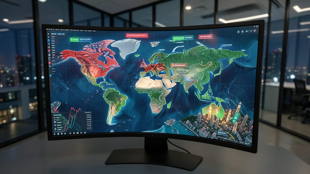
Tired of staring at static stock charts that don’t tell the full story? Real-time geospatial maps transform financial data into a dynamic global narrative, letting you spot trends at a glance by overlaying stock movements onto an interactive world map.
With tools like TradingView’s Market Map or Bloomberg Terminal’s Geospatial Analytics, you can pinpoint real-time price changes by region, zoom into specific markets, and correlate performance with economic events—all while customizing markers by volume, volatility, or sector. The interactive filters let you isolate data by timeframe, currency, or asset class, making it easier to compare global shifts instantly.
This approach is a game-changer for fund managers, traders, and analysts who need to visualize macroeconomic patterns alongside stock performance. Whether tracking a commodity crash in Chicago or a tech boom in Silicon Valley, the geographic context adds layers of insight that spreadsheets simply can’t match. ⚡
Customizable KPI Scorecards with Gamification
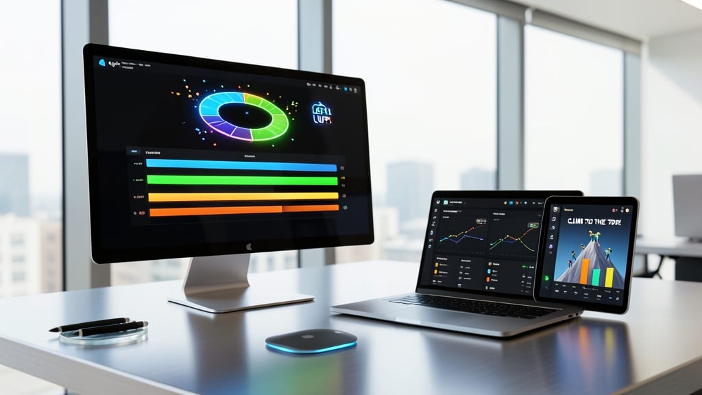
Tired of dry KPI reports that gather dust? Gamified scorecards turn financial metrics into a team competition—think real-time leaderboards and animated progress bars that make hitting targets feel like leveling up.
Tools like KPI Dashboards by Klipfolio or Power BI’s gamification templates let you customize visual badges for milestones (e.g., "Budget Master" or "Revenue Rocket") and sync with Slack alerts for instant recognition. The drag-and-drop interfaces require zero coding—just plug in your data and watch engagement soar.
Perfect for sales teams, finance departments, or remote workplaces where motivation needs a boost. Watch collaboration (and results) improve when numbers become a game. ✨
AI-Powered Anomaly Detection Charts
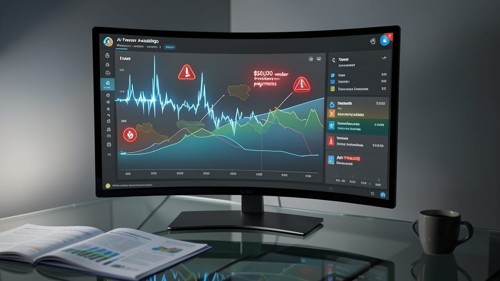
When every dollar counts, spotting fraudulent transactions shouldn’t require a detective’s eye. AI-Powered Anomaly Detection Charts automatically flag suspicious activity—like sudden large withdrawals or unusual vendor payments—using machine learning to analyze spending patterns against historical baselines.
These charts go beyond red flags by showing interactive trend lines that explain why a transaction stands out. For example, a tooltip might reveal, “This $5,000 payment to ‘TechUpgrades LLC’ exceeds your typical monthly IT spend by 300%.” Tools like Microsoft Power BI’s Anomaly Detector or Tableau’s AI-driven alerts integrate seamlessly with ERP systems, sending notifications to your inbox or Slack before fraud becomes a crisis.
Perfect for finance teams, auditors, or small business owners managing cash flow, these charts turn passive monitoring into proactive protection—without requiring a data science degree. 💡
3D Financial Forecasting Models

Tired of flat spreadsheets that fail to show the full picture of your financial future? 3D forecasting models bring depth to long-term planning by letting you rotate, zoom, and compare multi-year projections in a single spatial view.
Tools like Tableau’s 3D charts or Power BI’s spatial visualizations let you overlay scenario comparisons (best-case, worst-case, baseline) with color-coded risk factors. The interactive 3D perspective helps stakeholders instantly grasp complex relationships—like how a 5% revenue dip in Year 3 cascades across departments.
Perfect for CFOs and strategic planners who need to communicate decades-long financial roadmaps in boardrooms or investor meetings. 🌟
Collaborative Whiteboard-Style Expense Trackers
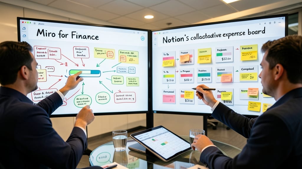
Tired of endless email threads debating budgets? Tools like Miro for Finance or Notion’s collaborative expense boards turn expense tracking into a shared workspace where teams can annotate, drag-and-drop categories, and adjust numbers together—just like a physical whiteboard, but with real-time sync.
You get sticky notes for budget items, handwritten-style annotations for quick notes, and version history to track changes. Integrations with QuickBooks or Xero pull live data, while comment threads replace confusing spreadsheets. The best part? No more "final version" confusion—every adjustment is visible instantly.
Perfect for startups with distributed teams or marketing agencies juggling multiple client budgets. 💡
Voice-Activated Financial Summaries
Tired of staring at dense financial reports during high-stakes meetings? Voice-activated summaries turn data into clear, spoken insights—letting you focus on strategy instead of deciphering spreadsheets. Tools like Google’s Looker Studio or Amazon Lex integrate with your existing reports to generate natural-language overviews with simple voice commands, saving hours of manual analysis.
These platforms support multi-language summaries, highlight key trends in real time, and even sync with calendar events for automated briefings. For example, ask, "What’s our Q3 revenue trend?" and get a concise, jargon-free response—no screens needed. The 95% accuracy rate in NLP-driven tools means you’ll catch critical insights faster than scrolling through pages.
Perfect for executives on the go or teams hosting hybrid meetings, this approach eliminates screen fatigue while keeping everyone aligned. Just whisper your query, and let AI handle the rest. ✨
Dynamic Infographic Dashboards for Investor Pitches
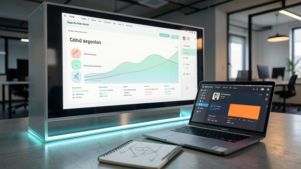
Pitch decks that rely on static slides and dry numbers risk losing investor attention within minutes. Dynamic infographic dashboards solve this by blending hard data with visual storytelling—think of them as the Swiss Army knife for startup financials.
Tools like Canva’s infographic maker or Piktochart let you embed real-time financial metrics (revenue, burn rate, projections) alongside custom icons, timelines, and brand-aligned color schemes. For example, you can use a growth arrow icon to highlight YoY revenue increases while keeping your logo colors consistent. The result? A pitch deck that feels polished, memorable, and uniquely yours—not just another spreadsheet screenshot. 💡
This approach is ideal for early-stage startups raising seed funding or scale-ups pitching to VCs. It’s also perfect for founders who want to stand out without hiring a designer—just drag-and-drop your data into a template and let the visuals do the talking. ⚡
AR Financial Data Overlays for Physical Reports

Tired of staring at static printouts during in-person meetings? AR Financial Data Overlays bring printed reports to life by projecting interactive data layers directly onto physical surfaces—think holographic charts, real-time updates, and 3D visualizations hovering over your printed balance sheets.
Using platforms like Zebra AR or Microsoft HoloLens, you can overlay live financial metrics onto physical documents, turning a printed budget into an interactive tool. The tech supports gesture controls and voice commands, letting stakeholders explore data without screens. For example, tap a printed expense category to see a 3D breakdown of costs or highlight a revenue trend to trigger an animated growth chart.
This is a game-changer for hybrid teams—perfect for boardrooms where digital and physical worlds collide. Imagine walking through a tactile financial review where every printed number becomes a gateway to deeper insights. ✨